A website page should do more than simply describe what you sell. Whether it is a product page for an online shop or a service page for a local business, it needs to turn interest into action. That means helping visitors understand what you offer, why it matters, why they should trust you and what they need to do next.
Too many pages stop at the description stage. They list features, add a few images and hope the visitor will take the next step alone. In reality, people usually need more guidance than that. They want reassurance, clarity and a reason to act. If a page is vague, cluttered or difficult to navigate, even strong products and services can struggle to convert.
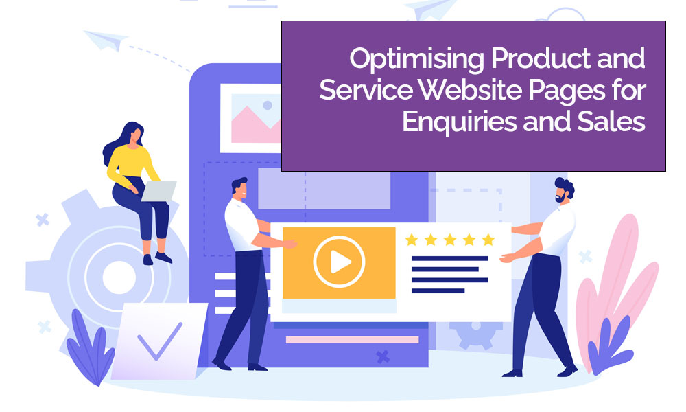
This is where good website design and website optimisation make such a difference. A high-performing page is not just attractive. It is structured with purpose. It highlights benefits clearly, uses visuals well, builds trust through proof and makes the next step feel obvious. When those elements work together, the page becomes far more effective at generating enquiries and sales.
Start with clarity, not cleverness
The first job of any product or service page is to make the offer instantly clear. Visitors should not have to work out what you do, who it is for or why it matters. If the page opens with generic wording, overcomplicated headlines or too much jargon, people may leave before they have understood the value at all.
Clear page structure is one of the most important parts of website optimisation. A good heading should explain the offer quickly. Supporting text should make the core value obvious. Visitors should be able to scan the page and understand the basics within seconds.
This matters because most users do not read every word from top to bottom. They scan first. If the page communicates clearly at a glance, they are more likely to stay and explore further. If it does not, the design may look polished but the page will still underperform.
Lead with benefits, not just features
One of the most common page mistakes is focusing too heavily on features without explaining what those features mean for the customer. Features are important, but benefits are what usually drive action.
A feature tells the visitor what something includes. A benefit tells them why that inclusion matters. For example, saying that a website package includes mobile-responsive design is a feature. Explaining that it helps customers browse and enquire more easily on phones is the benefit. Saying that a product is made from waterproof material is a feature. Explaining that it helps keep children comfortable on wet school mornings is the benefit.
Strong website design supports this by making benefits easy to spot. This could mean using short sections, icon-led highlights, comparison blocks or scannable bullet points in the right places. The key is to avoid walls of text that bury the value.
When visitors can quickly connect your offer to their needs, they are much more likely to move towards an enquiry or purchase.
Use visuals to support decision-making
Visuals do far more than decorate a page. They help people judge quality, build confidence and understand what they are buying. For products, that often means strong photography from different angles, close-up detail shots and images that show scale or real-life use. For services, it may mean portfolio examples, process graphics, team imagery or screenshots that make the offer feel tangible.
Good visuals support both trust and conversion. They give the page energy and help break up information, but they also reduce uncertainty. A visitor is far more likely to make contact or buy if they feel they can picture the outcome clearly.
This is why website optimisation is not only about keywords and speed. It is also about presentation. If the visuals are poor, outdated or inconsistent, they can undermine the message no matter how strong the written content may be.
The strongest pages usually use visuals with intention. Each image should help answer a question, support a claim or reinforce the quality of the offer.
Build trust with social proof
People are more comfortable taking action when they can see that others already have. Social proof is one of the most effective ways to strengthen a product or service page because it reduces doubt and adds credibility.
This can take different forms depending on the business. Testimonials are often the most obvious example. A good testimonial feels specific rather than generic. It should hint at the result, the experience or the reason the customer was pleased. Reviews, ratings, client logos, case study summaries and before-and-after examples can also all help.
For services, social proof is particularly important because visitors are often buying something intangible. They are not just buying a deliverable. They are buying confidence in your expertise. Trust signals help bridge that gap.
For products, reviews can answer unspoken questions about quality, sizing, ease of use or delivery experience. They help visitors feel less like they are taking a risk.
A page without social proof can still work, but a page with relevant proof usually works harder.
Make calls-to-action obvious and persuasive
A call-to-action should not feel like an afterthought. If someone lands on a page, understands the offer and starts to trust the business, the next step should be easy to spot and easy to take.
This sounds simple, but many pages still hide their calls-to-action, make them too vague or place them only at the bottom of a long page. A strong CTA tells the visitor what to do and gives them a reason to do it now. “Get a quote”, “Book a consultation”, “Buy now”, “Request a demo” or “Speak to our team” are all clearer than weaker phrases such as “Learn more” or “Submit”.
Good website design gives CTAs the visibility they deserve. They should stand out visually, appear at sensible points across the page and match the visitor’s intent. A product page might focus on purchase-driven buttons, while a service page may benefit from softer conversion points too, such as enquiry forms, callback options or downloadable guides.
The best pages also reduce friction around the CTA. That might mean shorter forms, clearer reassurance about what happens next, or nearby trust signals that make taking action feel safer.
Think about flow, not just individual elements
A successful page is rarely built from one great element alone. It is the combination that matters. Clear messaging, benefits, visuals, proof and CTAs need to work as a sequence. The visitor should move naturally from understanding the offer to believing in it and then acting on it.
This is where website optimisation becomes a broader discipline rather than a simple checklist. It involves reviewing the page from the user’s perspective. Does it answer the obvious questions? Does it remove doubt? Does it build momentum? Is there anything distracting, confusing or slowing the visitor down?
Sometimes small improvements create big gains. Rewriting a headline, replacing weak images, improving testimonial placement or clarifying a CTA can all help lift performance.
Don’t forget mobile performance
A page may look excellent on desktop and still struggle on mobile. Since so many users now browse and buy on phones, product and service pages must be easy to use on smaller screens. Headlines need to stay clear, buttons need to remain visible, forms need to be manageable and layouts need to feel clean rather than cramped.
This is another reason website design and website optimisation go hand in hand. A page that is beautifully designed but frustrating to use on mobile will lose valuable traffic before conversion even becomes possible.
Better pages create better results
Optimising product and service website pages is really about one thing: making it easier for the right visitor to say yes. That means showing the offer clearly, focusing on benefits, using strong visuals, adding believable social proof and guiding people with effective calls-to-action.
When those ingredients are in place, pages become more than online placeholders. They become active sales tools. They work harder for your business, support better user journeys and turn more of your existing traffic into real enquiries and sales.
In the end, the best-performing pages are not always the flashiest. They are the ones that understand what visitors need to see, feel and trust before they are ready to take the next step.