
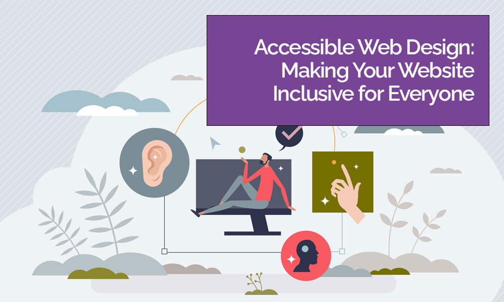
Accessibility in web design means building a site that people can use regardless of ability, device, or situation. That includes customers who rely on screen readers, people who can’t use a mouse, users with low vision or colour blindness, and anyone navigating your content on a cracked phone screen in bright sunlight. For UK organisations, accessibility is not just a “nice extra” — it’s increasingly a legal, ethical, and commercial priority, and it’s something a good website design agency should be able to plan, design, and test as part of a modern build.
What does accessibility actually mean?
Accessible web design is about removing barriers. In practice, it involves choices in layout, colours, typography, content structure, and code. You don’t need to be a specialist to understand the basics, but you do need to design with real users in mind.
A useful way to think about accessibility is: can someone perceive the content, understand it, and interact with it — without needing perfect vision, precise motor control, or a mouse? The most recognised framework for this is the Web Content Accessibility Guidelines (WCAG), which is widely used as the benchmark for accessible websites and apps.
Why accessibility matters legally in the UK
UK accessibility responsibilities depend on the organisation and the service being provided, but there are two key legal areas that often come up.
First, public sector bodies have specific legal requirements for websites and mobile apps, including meeting a WCAG level and publishing an accessibility statement.
Second, the Equality Act 2010 places duties on service providers to avoid discrimination and make reasonable adjustments for disabled people. While every situation is different, businesses that provide services to the public should treat accessibility as part of that duty of care — especially where digital channels are a key route to information, bookings, and support.
For many organisations, the safest approach is simple: design accessibly from the start, document decisions, and keep improving over time.
Why accessibility matters ethically
Your website is often the front door to your organisation. If a user can’t read your content due to tiny text, can’t complete a form using a keyboard, or can’t understand an image because there’s no alternative text, the message they receive is unintentional but clear: “This wasn’t made for you.”
Inclusive design is good design. It respects your audience, reduces frustration, and makes it easier for everyone to access your products and services. In many sectors — healthcare, education, charities, public-facing services, recruitment — the ethical case is obvious. In commercial sectors, it’s still just as relevant: you’re serving people, and people have different needs.
Why accessibility matters commercially
Accessible design improves business outcomes because it improves usability. When a site is easier to read, navigate, and interact with, more users complete the journey.
Commercial benefits typically include:
- lower bounce rates and higher engagement (people can actually use the site)
- higher conversion rates (forms, checkout, enquiries, bookings)
- stronger SEO foundations (clear structure, descriptive content, well-labelled images)
- reduced customer support friction (fewer “I can’t access…” issues)
- better brand trust and reputation
Accessibility is also future-proofing. As expectations rise, a design agency that treats accessibility as standard will save you expensive rebuilds later.
Font sizes and readability: making content comfortable
Accessibility starts with text that people can read. That sounds obvious, but many sites still use light grey text, tiny font sizes, and cramped line spacing — all of which create unnecessary effort.
Practical readability choices include:
- a base font size that’s comfortable across devices
- clear hierarchy (headings, subheadings, body text)
- sensible line length (avoid overly wide paragraphs)
- adequate line spacing and paragraph spacing
- not relying on all-caps blocks of text for style
It’s also important that text can be zoomed without breaking the page layout. Users should be able to increase size and still navigate smoothly, especially on mobile.
Colour contrast: when “on brand” isn’t enough
Colour contrast is one of the most common accessibility failures because it’s often introduced late — after colours are “locked in”. Good contrast helps users with low vision, colour blindness, migraines, and anyone viewing your site in poor lighting.
Key principles:
- ensure text stands out clearly from its background
- make buttons, links, and focus states obvious (not subtle)
- don’t rely on colour alone to communicate meaning (for example, “fields in red are required”)
A design agency can keep your brand look while still meeting contrast needs by adjusting shade, weight, size, and spacing rather than abandoning your palette.
Keyboard navigation: designing beyond the mouse
Many users navigate without a mouse — including people using screen readers, switch devices, or simply those who prefer a keyboard. If your site can’t be used via keyboard, it blocks basic interactions like navigation menus, filters, forms, and checkouts.
A keyboard-friendly site should:
- allow users to tab through links, buttons, and form fields in a logical order
- show a clear focus indicator (so users can see where they are)
- avoid traps (where focus gets stuck in a modal or menu)
- ensure interactive elements are actually interactive (not “fake buttons” made from non-clickable elements)
This is especially relevant for e-commerce, booking journeys, and recruitment pages where completion matters.
Alt text: making images meaningful (or invisible when they should be)
Alternative text (alt text) describes images for people who can’t see them. It’s essential for informative imagery, product shots that convey key details, icons with meaning, graphs, and banners that include text.
Good practice looks like this:
- describe what matters (not every detail)
- keep it short and specific
- avoid repeating nearby text
- use empty alt text for purely decorative images so screen readers skip them
Alt text also supports content clarity in other contexts: broken images, slow connections, and some search discovery workflows.
How to build accessibility into your next website project
Accessibility works best when it’s part of the process, not a bolt-on audit at the end. If you’re working with a website design agency (or reviewing your current design agency), ask how they handle accessibility across the full lifecycle.
A strong process usually includes:
- discovery questions about audiences, user needs, and compliance expectations
- design systems with accessible components (buttons, forms, navigation patterns)
- content structure guidance (headings, lists, link text, image usage)
- testing using keyboard-only navigation and screen reader checks
- clear documentation and a plan for ongoing improvements
Accessibility is not a one-off tick-box. Websites change: new pages, new products, new campaigns, new plugins. The goal is to set standards that keep the site inclusive as it grows.
Conclusion: accessibility is modern web design done properly
Accessible web design is about making your website usable for everyone — and that benefits your audience and your organisation. It supports legal resilience, demonstrates inclusive values, and improves commercial performance by reducing friction at every step.
If you want your next rebuild (or refresh) to last, choose a design agency that treats accessibility as a core part of quality. The result is a site that reads better, navigates better, converts better, and welcomes more people — which is exactly what a modern UK business website should do.