SERVICES / BRAND
Make your story unmistakable.
A considered identity across logo, typography, colour, design systems and digital touchpoints.
BRANDING / RECOGNISABLE FOR THE RIGHT REASONS
Branding and graphic design explained.
Branding and graphic design help people recognise your business and understand what it stands for. Digital Yak connects the thinking behind the brand with the practical assets your team uses, from visual identity and website design to campaign materials. The starting point is your audience and offer, so the result communicates something specific about the business rather than simply following a visual trend.

01 / THE DETAIL
Clarify what the brand needs to communicate
A useful brand brief explains who the business serves, what it provides and why its approach matters to those customers. It should also describe the situation in which people encounter the brand. A specialist consultancy, an independent hotel and an aesthetic clinic may need very different signals of confidence.
We explore the business's position before developing visual directions. That includes the character you want to convey, the expectations of your audience and the differences that can be supported by the way you work. Clear decisions here make it easier to assess a design against a purpose rather than personal taste alone.
This stage can also reveal a mismatch between the business and its current presentation. An established company may look like a start-up, or a warm, personal service may appear unnecessarily distant. The objective is to bring those signals into alignment. A strong identity should make the business easier to recognise without asking design to compensate for an unclear or unsupported offer.
02 / THE DETAIL
Develop an identity that works as a system
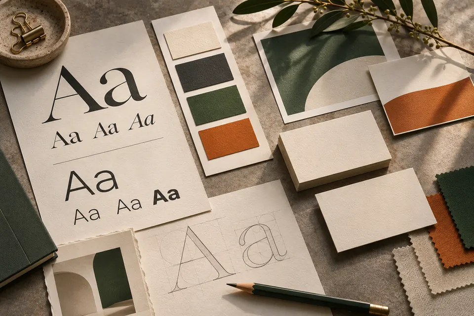
A logo is one element within a visual identity. Typography, colour, spacing, image direction and supporting graphic elements all influence how the business is perceived. They need to work together across the places the brand will actually appear.
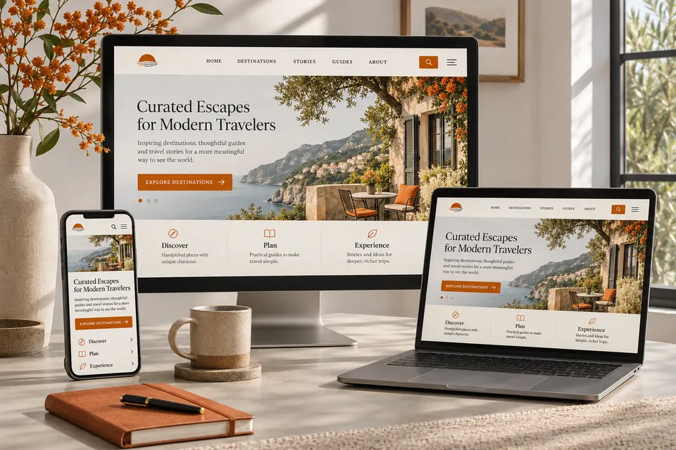
We consider practical applications during development. A mark that looks effective on a large presentation may need an alternative arrangement for a small website header or social profile. A colour combination needs to remain readable when used for text and controls. An image style should be realistic for the assets the business can maintain.
The result should give the brand enough consistency to be recognisable and enough flexibility to serve different formats. We avoid making every application look identical when its purpose differs. A detailed proposal, a short social message and a website landing page can share a visual language while giving information the emphasis and space it needs in each setting.
03 / THE DETAIL
Connect visual design with the words around it
The language of the brand influences how people interpret the visual design. A confident identity can be weakened by vague service descriptions, while an informal writing style may not fit a highly technical offer. We consider tone and message alongside appearance.
Useful brand messaging gives the team a clear way to explain the business. That may include a short description, service introductions, key messages and guidance about words or claims to use carefully. The aim is a practical reference rather than a list of adjectives that everyone interprets differently.
Website copy is an important application because it needs to communicate both identity and information. Visitors still need to understand what is offered, who it is for and what to do next. Our content marketing and copywriting service can develop those explanations, while website design brings the visual and written elements together in a usable digital experience.
04 / THE DETAIL
Create assets around the work your team actually does
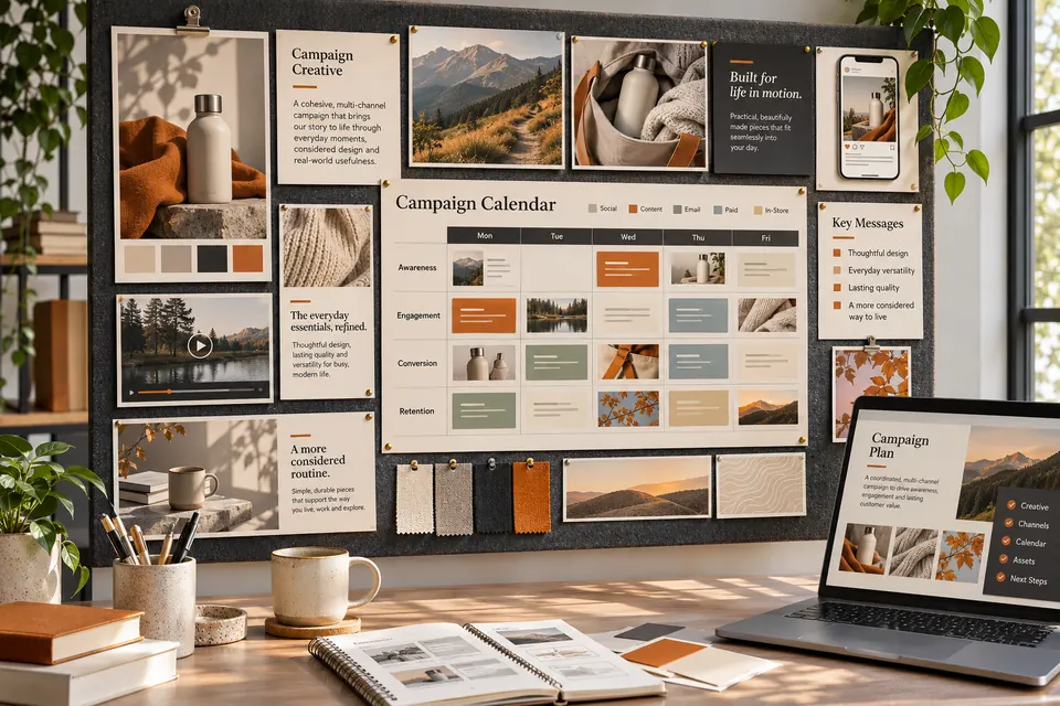
Brand assets should support the formats you use most often. That might include proposals, social graphics, presentation materials, email headers, printed literature or signage artwork. Identifying the applications early helps prioritise useful deliverables and avoid creating an extensive collection of files with little everyday value.
We establish the content and production requirements for each item. Printed material has different constraints from a responsive web page. A template intended for regular internal editing needs to suit the software and skills available to your team. A supplied production file should have a clear intended use.
The handover matters as much as the initial presentation. Teams need to understand which version to use and how the main elements fit together. Where templates or guidelines are included in the agreed scope, they should help maintain consistency without making ordinary updates difficult. The exact deliverables, file formats and any external production arrangements are defined in the proposal rather than assumed.
05 / THE DETAIL
Refresh the brand without losing what people recognise
A rebrand is not always the right response to an ageing identity. Sometimes the strongest option is to refine typography, improve image direction, simplify layouts or create a more consistent set of applications while retaining a recognisable core.
We review which elements have existing value. Customers may already recognise a name, colour or mark, even if its use has become inconsistent. Understanding that familiarity helps distinguish what should be preserved from what is genuinely preventing the business from presenting itself effectively.
A larger change needs a transition plan. Website assets, social profiles, documents and customer-facing materials may not all be updated at once. We help identify the important touchpoints and agree a practical sequence. This reduces the chance of the business appearing under several conflicting identities during the rollout. Any naming, intellectual property or registration questions should be resolved with the appropriate specialist as part of the wider business decision.
06 / THE DETAIL
A design process with a clear basis for feedback
We begin with the brief and the intended applications, then develop a direction that can be reviewed in context. Showing how an identity works on meaningful examples makes feedback more useful than assessing a logo in isolation on a blank page.
Your feedback should relate to the agreed audience and purpose. Which aspects communicate the right character? Where is the message unclear? Does an application work for the way the business uses it? Those questions help refine the system without turning every review into a new and unrelated creative brief.
Once the direction is agreed, we develop the scoped assets and check their practical use. A coordinated rollout can connect the identity with the website and the marketing programme. Start with a Growth Review if the business has evolved and its presentation has not kept pace. We can discuss whether you need a focused refresh, a broader identity project or a more consistent application of the brand you already have.
USEFUL ANSWERS
Your questions, answered.
Do we need a new logo to improve our brand?
Not necessarily. Inconsistent layouts, weak photography or unclear messaging may be the more important issue. We review the identity as a whole before recommending a change to its core elements. A focused refresh can retain recognition while giving the business a clearer and more coherent presentation.
Can you work within existing brand guidelines?
Yes. Existing guidelines and approved assets provide a useful starting point. We review how they apply to the requested formats and identify any missing guidance or practical limitations. If a change is needed, it should be agreed with the person responsible for the brand rather than introduced silently during production.
What should we prepare for a branding brief?
Bring existing assets, examples of current applications, information about your audience and a clear description of the offer. It is also helpful to identify what the present brand no longer communicates. Competitor examples can provide context, but the objective is to establish an appropriate identity for your business rather than copy another organisation's visual style.
BUILT FOR THE REAL WORLD
Thoughtful design. Measurable purpose.
Our approach connects strong creative work with a practical understanding of what clients and customers actually need.
01 / EXPLORE
Clarity of purpose
Make the value and character of your business easier to recognise.

02 / EXPLORE
Design that travels
Create an adaptable identity for website, social and campaigns.
THE NEXT STEP
Your next step starts here.
Tell us what you're looking for and we'll explore the right way forward.