DIGITAL EXPERIENCES
Websites worth spending time on.
Design that looks distinctive, loads efficiently and creates a clear route from first impression to enquiry.
For campaigns with a specific offer, explore our landing page design service.
WEBSITE DESIGN / BUILT AROUND YOUR CUSTOMERS
Website design and development explained.
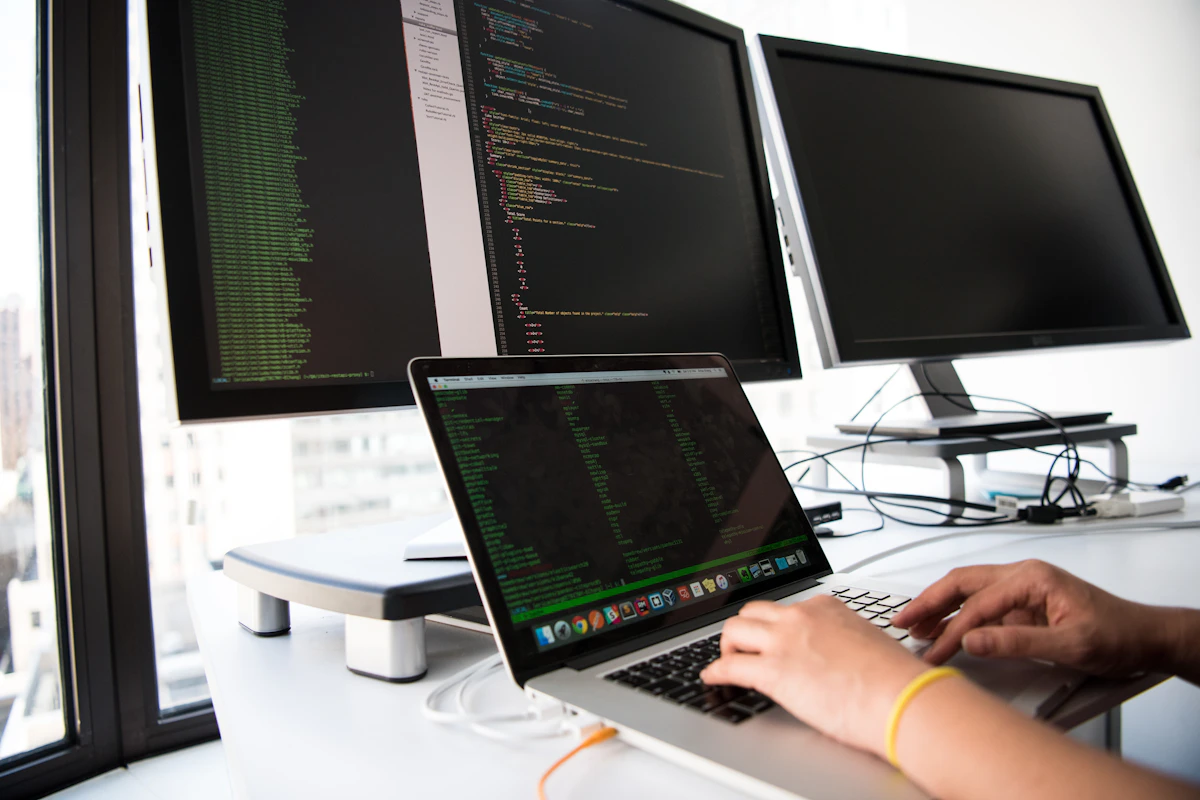
Website design and development brings together the way your business looks, the information your customers need and the technology that makes the experience work. Digital Yak creates websites with a clear commercial purpose, from an initial page plan to responsive design, WordPress development and launch preparation. The aim is a useful, distinctive website that your business can continue to manage.
01 / THE DETAIL
A website starts with the decisions it needs to support
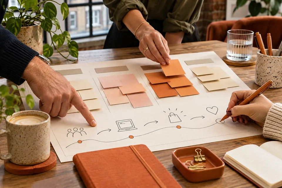
Before choosing colours or page layouts, we establish what your visitors need to do. They might be comparing specialist services, researching an appointment, checking availability or deciding whether to request a quote. Each journey requires a different combination of information, reassurance and action.
We turn those journeys into a page structure. Important services need a clear home, related topics need useful connections and contact routes need to appear where they make sense. The navigation should reflect how customers think about the business rather than simply reproducing an internal organisation chart.
This planning also helps control the project. We agree which pages are required for launch, what existing material can be retained and where new writing or photography is needed. Decisions made early reduce the risk of a visually complete website that is still missing the information people need to enquire. A smaller, coherent launch can be more useful than a sprawling site with unfinished sections.
02 / THE DETAIL
Distinctive design that remains clear on smaller screens
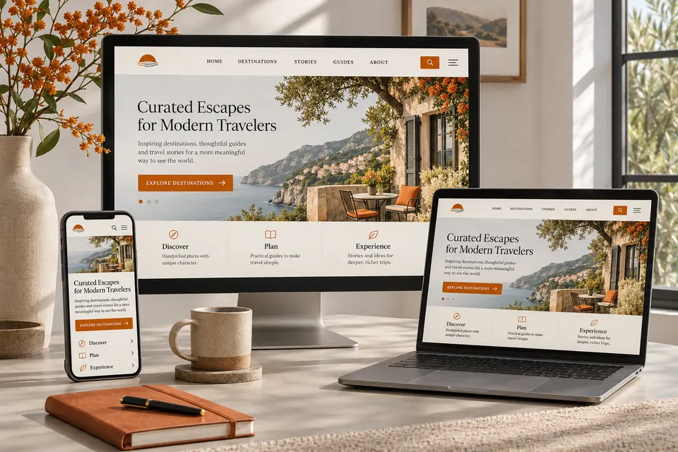
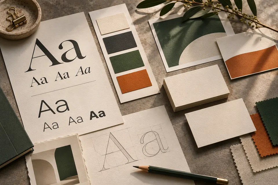
A website should feel recognisably yours while remaining easy to use. Typography, spacing, colour, imagery and motion work together to communicate the character of the business. We use them to establish emphasis and guide attention, rather than adding effects that compete with the message.
Responsive design means reconsidering the layout for the space available. A desktop composition may need a different order, image crop or navigation pattern on mobile. Buttons need room to tap, text needs comfortable line lengths and important controls should remain accessible without awkward scrolling or overlapping content.
We also consider people using keyboards and assistive technology. Heading order, link wording, visible focus states, meaningful image descriptions and readable contrast all contribute to a more usable experience. Accessibility is part of design and content decisions throughout the project. It should not depend on an overlay being added after everything else has already been built.
03 / THE DETAIL
Editable WordPress development with practical ownership
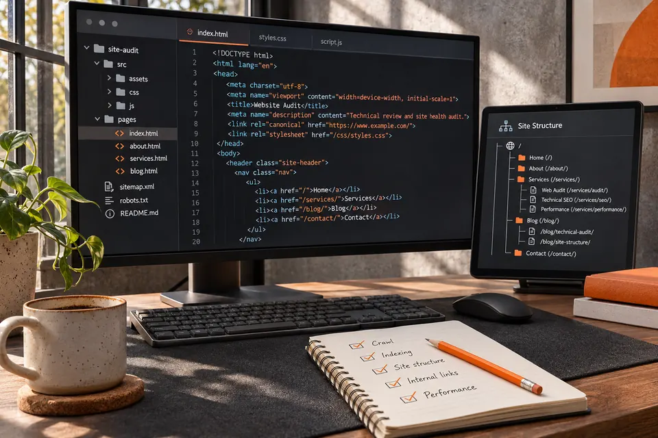
A website becomes more valuable when your business can keep it current. We build with editing in mind, separating headings, text, images and calls to action into manageable components. Routine changes should not require searching through a single large block of code.
The right editing structure depends on the project. Reusable patterns can keep related pages consistent, while individual modules allow important service content to evolve. We discuss the changes you expect to make, such as adding articles, updating a team profile, changing a price or replacing portfolio images, and design the content system accordingly.
We also consider integrations before development begins. Booking tools, forms, CRM connections and email platforms may have different technical requirements and ongoing costs. Confirming those dependencies early avoids presenting an integration as finished when access or supplier configuration is still required. For platform-specific projects, explore our WordPress website design service and its approach to maintainable editing.
04 / THE DETAIL
Search foundations belong in the build
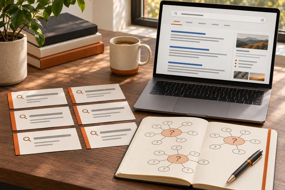
A new website needs to explain its subject clearly to people and search systems. We consider page purpose, headings, descriptive URLs, metadata and internal links as part of the build. Important information should appear as readable content rather than being available only inside an image or animation.
When replacing an existing site, we review the pages and URLs that already attract interest. Useful content and established destinations should not disappear simply because the visual design is changing. Redirect planning, link updates and checks on indexability help connect the previous website with the new structure.
These foundations also matter for AI-assisted discovery. Clear service descriptions, consistent business information and direct answers make the site easier to interpret. They do not guarantee inclusion or citation by any search or AI platform. Ongoing SEO services can build on the launch through deeper content, technical refinement and performance monitoring as the website develops.
05 / THE DETAIL
Images, speed and the details that make pages feel finished
Large, relevant images can give a website personality without making every page heavy. We choose suitable dimensions, use efficient formats where appropriate and avoid sending an unnecessarily large asset to a small screen. Image descriptions should explain meaningful content, while decorative elements should not distract from it.
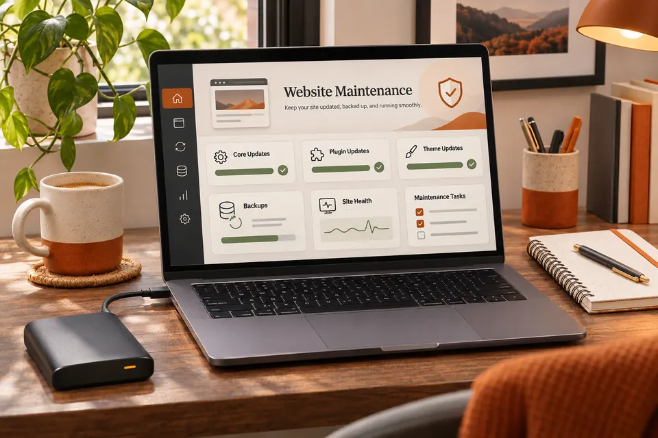
Performance is affected by more than image compression. Fonts, plugins, third-party scripts, video and hosting all contribute to how a page loads and responds. We review those dependencies and make practical choices about what needs to load immediately and what can wait until it is useful.
The finishing work includes forms, error messages, menu behaviour, image crops and confirmation journeys. A successful enquiry experience needs to work beyond the appearance of its submit button. We check the intended destination and confirmation behaviour with the access available, and identify any external configuration that still needs your input. This makes the launch checklist a record of evidence rather than a list of assumptions.
06 / THE DETAIL
From discovery to launch and continued improvement
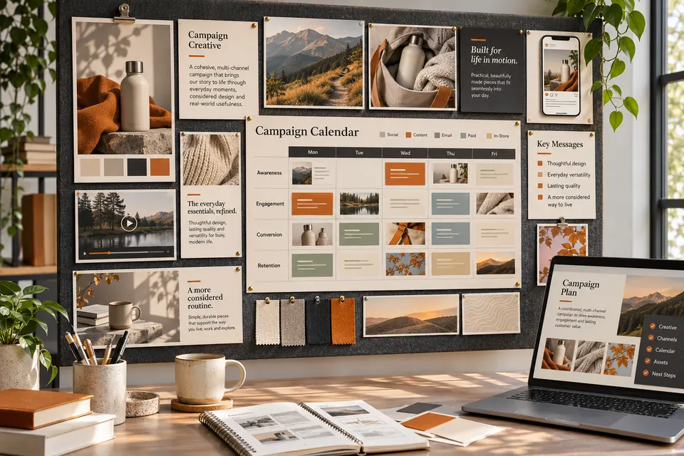
The project begins with a brief covering the business, audiences, goals, existing website and essential functionality. We then develop a structure and design direction before building the agreed pages. Your feedback is most useful when it relates to those goals: what needs more emphasis, what is unclear and which practical details customers ask about.
Before launch, we review the site on different screen sizes and test important journeys. Content accuracy, contact information, links, redirects, search settings and analytics requirements all need attention. Where a domain move or production deployment is involved, the final release is a separate step with its own checks.
After launch, the website should remain an active business asset. New questions, changing services and performance information can reveal the next improvements. Our website care and support work provides a route for keeping it current. To discuss a new build or a replacement site, start with a Growth Review and tell us what the existing website is preventing you from doing.
USEFUL ANSWERS
Your questions, answered.
Do I need a completely new website?
Not always. Some sites can be improved through focused changes to content, navigation, design or performance. We assess the current platform and the scale of the problem before recommending a rebuild. If the foundations remain suitable, a phased improvement programme may be the more practical investment.
Can I supply my own text and images?
Yes. Your knowledge, customer questions, original photography and existing brand assets are useful starting points. We review how that material fits the page structure and explain where editing or additional content would help. Image suitability includes resolution, permissions, relevance and how the subject crops across different devices.
How is the scope and cost agreed?
The scope depends on page count, content requirements, design complexity, integrations and any migration work. We establish those requirements before confirming a proposal. Ongoing items such as hosting, maintenance or third-party software should be identified separately so you can compare the initial project with the continuing cost of running the site.
OUR APPROACH
Designed around real decisions.
Before visual design, we consider your customers, content, user journeys and long-term editing requirements.
FROM BRIEF TO BUILD
A process built for better websites.
01
Plan
Research, architecture, priorities and user journeys.
02
Design
Responsive concepts and an agreed visual language.
03
Develop
Editable WordPress components and useful integrations.
04
Improve
Testing, measurement and ongoing refinement.
YOUR NEXT WEBSITE
More than a new coat of paint.
Build the right foundations for today and the flexibility for tomorrow.
WEBSITE DESIGN / THE DETAIL
Designed to work. Built to evolve.
Website design combines the visual experience with thoughtful page architecture, performance and a content system your team can maintain.
01
Discovery and page planning
Agree audiences, key journeys and page requirements before building.
02
Responsive visual design
Consider navigation, readability and user journeys across desktop, mobile and tablet.
03
Editable WordPress foundations
Keep headings, images, sections and calls to action manageable through Divi.
04
Testing and refinement
Check accessibility, links, redirects, SEO essentials, performance and enquiries before launch.